Client: A&R Development
Services: Interior Design, Hand-Lettering, Custom Fabrications, Sourcing of found objects and art, Creative Consulting on all aspects of the interior and exterior
Opal Stackhouse was hired to oversee the redo of the interior and exterior of The Crest Tavern - one of Columbus’ oldest dive bars, and create the look and feel of the new Crest. The 2900 square foot space was transformed in 4 months into The Crest Gastropub - A classic bar with refined details and a welcoming feel.
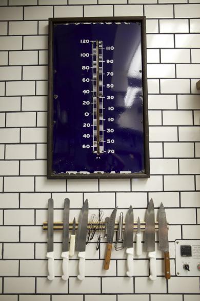
Our intent for the space was to create an environment that, while drastically different from the previous structure (The original Crest Tavern), felt like it naturally fit into the neighborhood. Our goal was to make a pleasant impression from the curb to the table. Throughout the design and buildout, Opal Stackhouse returned over-and-over again to details that would reflect a cared for and thoughtful space. In every possible way we attempted to convey the feeling of handmade.
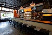
We wanted the space to feel like a melded bar and kitchen. One aspect does not overshadow the other. There is the feeling of communal dining. Anywhere you sit you can see all areas of the space, yet different seating areas serve various diner needs.
In early stages of the construction and design process we happened upon a motherload of beautiful warehouse windows, and had them installed between the kitchen, restrooms, and the rest of the restaurant. Introducing this frosted glass to the space, up high, created a whole new sense of depth. The globe pendants appeared as moons behind the glass. We hung the globes at different measured heights throughout. Light bounces actively, unevenly, and is reminiscent of a string of lights in a garden.
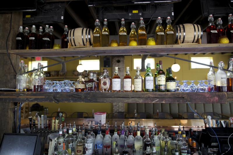
The backbar was meant to seem effortless and as part of the architecture. Antique painters scaffolding was used to bridge the distance between two existing beams.
Simple shelving from butcher block and gas pipe (materials leftover from other projects in the space) line the restaurant walls in lieu of hanging traditional art. We wanted the space to feel like it was put together by someone that cares - but not overly “designed”. The shelves were intended to be for fresh cuts from the garden (in the summer months) and canned goods and dried flowers in the winter months. The “art” was supposed to be “fresh” and seasonal.
Custom made for the space:
- Shelving for island bar
- Bench seating for 12 out of antique painter’s scaffolding and chestnut barn wood
- Oak butcher block tables with antique claw foot bases
- Recast brass hooks
- Cast brass lamb logo
- Antique butcher block standing tables with steel tubing base
- Liquor bottle riser
- Vintage medicine cabinet retrofitted shelf
- Vintage trays made into tray holders
- Hand lettered doors & chalkboards
- Aged brass curtain rods and holders
- Hand-sewn cafe curtains
- Custom globe lighting and sconces
April 2013


